
Why Cracker Barrel’s New Logo Failed (and What Brands Can Learn)
Discover why Cracker Barrel’s logo change backfired and what the science behind nostalgia, brand quirks, and listening can teach you.
BRAND STRATEGY
Kelsey Hochstetler
8/28/20253 min read
Why Cracker Barrel’s New Logo Failed (and What Brands Can Learn)
We all felt it in our bones. That cozy, porch-swing memory we carried when we saw the old Cracker Barrel logo (Uncle Herschel leaning on a barrel) felt like home. When the restaurant chain launched a new Cracker Barrel logo without the old man, the familiar warmth was gone. What happened next wasn’t just internet outrage, it became a lesson in brand identity and customer loyalty. And what unfolded still has leaders talking.
1. Your Quirks Are Your Superpower
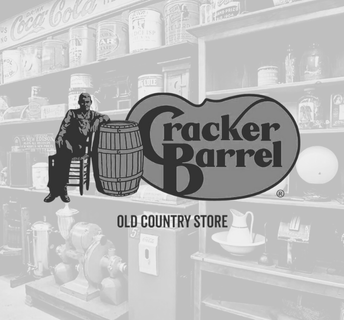
The old Cracker Barrel design wasn’t sleek or modern. It was outdated. A man in suspenders leaning against a wooden barrel? That’s not minimalism. But it worked, because it told a story: comfort food, Southern hospitality, and nostalgia that felt like Sunday afternoons at Grandma’s.
When the company unveiled a text-only Cracker Barrel logo redesign, it stripped away that nostalgia. Customers didn’t just see new typography; they saw a beloved part of their experience vanish.
Here’s the truth: your quirks make you memorable. They’re the reason customers feel connected to you.
The Science Behind Nostalgia
And there’s real science behind this that I learned in my consumer behavior class. It’s stuck with me because I’ve seen it play out in real life. Nostalgia gives people comfort during times of uncertainty, lowering anxiety and making a brand feel safe. It deepens emotional bonds, which is why customers stay loyal and are even willing to spend more when a brand connects to their memories. (Read more about the Study of the Impact of Nostalgia Marketing on Consumer Behavior). Did you know it also taps into our tendency to remember the past more fondly than it really was, while boosting perceptions of authenticity in a world where so much feels manufactured. In other words, nostalgia isn’t just sentiment; it’s strategy.
Think about your brand (not just your logo). What detail would your audience miss if it disappeared tomorrow?
2. Subtraction Isn’t Always Clarity
Modern branding often chases simplicity. Clean lines. Flat fonts. Less clutter. (I get it, I’m a sucker for that, too!) But when Cracker Barrel simplified their logo, the result wasn’t clarity, it was confusion.
Why? Because what they removed wasn’t noise, it was their brand’s narrative. The old illustration wasn’t an extra, it was the essence of who they are. By subtracting it, the company unintentionally told customers, “We don’t value the part of us that feels like home.”
Consumer psychology supports this too. People aren’t just scanning for clarity, they’re looking for meaning. When you strip away too much, you risk losing the emotional cues that help customers feel grounded. Research shows that when consumers encounter too little information or too much uniformity, they experience decision fatigue instead of clarity. In other words, subtraction can create emptiness, not simplicity.
Are you subtracting design elements for style’s sake or keeping the details that carry emotional weight?
3. Listening Is the Hardest Part (But the Most Powerful)
When Cracker Barrel faced backlash over its new logo, leadership had a choice: dig in or listen. To their credit, they listened. Within days, they reversed the rebrand and restored the original design.
I’ve been in executive leadership rooms where we made bold choices like this, sometimes even reversed them after public backlash. It’s humbling. But it taught me this: when you listen, you gain something more valuable than pride: you gain trust.
In Cracker Barrel’s case, customers forgave quickly, not because the company was perfect, but because they admitted a mistake and responded with humility.
When was the last time you let your audience steer the ship, and did it build more trust than you expected?
Final Takeaway: Nostalgia Is a Marketing Superpower
The Cracker Barrel logo change controversy is more than a branding blip; it’s a masterclass in what makes a brand human. People don’t want sleek for sleek’s sake. They want a connection. They want to feel at home.
If you’re a business owner or marketing leader, remember:
Quirks are your brand’s superpower.
Don’t let minimalism erase meaning.
Listening builds lifelong trust.
Because at the end of the day, nostalgia isn’t just emotion, it’s a brand strategy. And the brands that honor their story are the ones that stay in people’s hearts (and on their shopping lists).
Didn’t Catch the Whole Cracker Barrel Story? Here’s the Gist of It.
Why did Cracker Barrel change its logo?
Cracker Barrel tried to modernize its brand with a text-only logo, removing the iconic old man and barrel illustration. The goal was simplicity, but customers felt it erased the heart of the brand.
Why did people dislike the new Cracker Barrel logo?
Fans said the new design looked generic and lost the “down-home” feeling that made the restaurant special. Social media reactions were overwhelmingly negative.
Did Cracker Barrel bring back the old logo?
Yes. After facing backlash, Cracker Barrel quickly reversed the decision and reinstated the classic logo.
What can brands learn from the Cracker Barrel logo backlash?
Brand identity isn’t just visuals—it’s an emotional connection. Removing nostalgic quirks can break trust, while listening and reversing a misstep can rebuild it even stronger.

© 2025 Journey Marketing. All rights reserved.